R: Life Modelling Recipes#
By Pat Reen - originally published on his GitHub site here, which has the original code.
Overview#
Background#
This section sets out a few practical recipes for modelling with (life) insurance data. Insurance events are typically of low probability - these recipes consider some of the limitations of “small data” model fitting (where the observations of interest are sparse) and other topics for insurance like comparisons to standard tables. Themes
Common data transforms, summary stats, and simple visualisations
Regression
Grouped vs ungrouped data
Choice of: response distribution, link (and offsets), explanatory variables
Modelling variance to industry / reference (A/E or A - E)
Model selection: stepwise regression, likelihood tests, model evaluation
Predictions, confidence intervals and visualisations
As with other recipes, the code can be found on GitHub.
Libraries#
A list of packages used in the recipe book.
library(rmdformats) # theme for the HTML doc
library(bookdown) # bibliography formatting
library(kableExtra) # formatting tables
library(scales) # data formatting
library(dplyr) # tidyverse: data manipulation
library(tidyr) # tidyverse: tidy messy data
library(corrplot) # correlation matrix visualisation, optional
library(ggplot2) # tidyverse: graphs
library(pdp) # tidyverse: arranging plots
library(GGally) # tidyverse: extension of ggplot2
library(ggthemes) # tidyverse: additional themes for ggplot, optional
library(plotly) # graphs, including 3D
library(caret) # sampling techniques
library(broom) # tidyverse: visualising statistical objects
library(pROC) # visualising ROC curves
library(lmtest) # tests for regression models
# packages below have some interaction with earlier packages, not always needed
library(arm) # binned residual plot
library(msme) # statistical tests, pearson dispersion
library(MASS) # statistics
Further reading#
A few books and articles of interest:
R Markdown Cookbook has everything you need to know to set up an r markdown document like this one.
Generalised Linear Models for Insurance Data is a great book introducing GLMs in the context of insurance, considering problems specific to insurance data.
Tidyverse documentation full set of documentation for Tidyverse packages (packages for data science) e.g. dplyr for data manipulation; tidyr for tidying up messy data; ggplot for visualisation.
Data Simulation#
This section sets out a method for generating dummy data. The simulated data is intended to reflect typical data used in an analysis of disability income incidence experience and is used throughout this analysis. Replace this data with your actual data.
More detail on the techniques used can be found in the section on data manipulation.
Simulating policies#
We start by simulating a mix of 200k policies over 3 years. Some simplifying assumptions e.g. nil lapse / new business (no allowance for part years of exposure), no indexation. Mix of business assumptions for benefit period, waiting period and occupation taken taken from James Louw. 2012, with the remainder based on an anecdotal view of industry mix not intended to be reflective of any one business.
# set the seed value (for the random number generator) so that the simulated data frame can be replicated later
set.seed(10)
# create 200k policies
n <- 200000
# data frame columns
# policy_year skewed to early years, but tail is fat
df <- data.frame(id = c(1:n), cal_year = 2018,policy_year = round(rweibull(n, scale=5, shape=2),0))
df <- df %>% mutate(sex = replicate(n,sample(c("m","f","u"), size=1, replace=TRUE, prob=c(.75,.20,.05))),
smoker = replicate(n,sample(c("n","s","u"), size=1, replace=TRUE, prob=c(.85,.1,.05))),
# mix of business for benefit_period, waiting_period, occupation taken from industry presentation
benefit_period = replicate(n,sample(c("a65","2yr","5yr"), size=1, replace=TRUE, prob=c(.76,.12,.12))),
waiting_period = replicate(n,sample(c("14d","30d","90d","720d"), size=1, replace=TRUE, prob=c(.04,.7,.15,.11))),
occupation = replicate(n,sample(c("prof","sed","techn","blue","white"), size=1, replace=TRUE, prob=c(.4,.2,.2,.1,.1))),
# age and policy year correlated; age normally distributed around 40 + policy_year (where policy_year is distributed around 5 years), floored at 25, capped at 60
age = round(pmax(pmin(rnorm(n,mean = 40+policy_year, sd = 5),60),25),0),
# sum_assured, age and occupation are correlated; sum assured normally distributed around some mean (dependent on age rounded to 10 and on occupation), floored at 500
sum_assured =
round(
pmax(
rnorm(n,mean = (round(age,-1)*100+ 1000) *
case_when(occupation %in% c("white","prof") ~ 1.5, occupation %in% c("sed") ~ 1.3 , TRUE ~ 1),
sd = 2000),500),
0)
)
# generate 3 years of exposure for the 200k policies => assume no lapses or new business
df2 <- df %>% mutate(cal_year=cal_year+1,policy_year=policy_year+1,age=age+1)
df3 <- df2 %>% mutate(cal_year=cal_year+1,policy_year=policy_year+1,age=age+1)
df <- rbind(df,df2,df3)
Expected claim rate#
Set p values from which to simulate claims. The crude p values below were derived from the Society of Actuaries Analysis of USA Individual Disability Claim Incidence Experience from 2006 to 2014 (SOA, 2019), with some allowance for Australian industry differentials (Ian Welch. 2020).
# by cause, age and sex, based upon polynomials fitted to crude actual rates
# sickness
f_sick_age_m <- function(age) {-0.0000003*age^3 + 0.000047*age^2 - 0.00203*age + 0.02715}
f_sick_age_f <- function(age) {-0.0000002*age^3 + 0.000026*age^2 - 0.00107*age + 0.01550}
f_sick_age_u <- function(age) {f_sick_age_f(age)*1.2}
f_sick_age <- function(age,sex) {case_when(sex == "m" ~ f_sick_age_m(age), sex == "f" ~ f_sick_age_f(age), sex == "u" ~ f_sick_age_u(age))}
# accident
f_acc_age_m <- function(age) {-0.00000002*age^3 + 0.000004*age^2 - 0.00020*age + 0.00340}
f_acc_age_f <- function(age) {-0.00000004*age^3 + 0.000007*age^2 - 0.00027*age + 0.00374}
f_acc_age_u <- function(age) {f_sick_age_f(age)*1.2}
f_acc_age <- function(age,sex) {case_when(sex == "m" ~ f_acc_age_m(age), sex == "f" ~ f_acc_age_f(age), sex == "u" ~ f_acc_age_u(age))}
# smoker, wp and occ based upon ratio of crude actual rates by category
# occupation adjustment informed by FSC commentary on DI incidence experience
f_smoker <- function(smoker) {case_when(smoker == "n" ~ 1, smoker == "s" ~ 1.45, smoker == "u" ~ 0.9)}
f_wp <- function(waiting_period) {case_when(waiting_period == "14d" ~ 1.4, waiting_period == "30d" ~ 1, waiting_period == "90d" ~ 0.3, waiting_period == "720d" ~ 0.2)}
f_occ_sick <- function(occupation) {case_when(occupation == "prof" ~ 1, occupation == "sed" ~ 1, occupation == "techn" ~ 1, occupation == "blue" ~ 1, occupation == "white" ~ 1)}
f_occ_acc <- function(occupation) {case_when(occupation == "prof" ~ 1, occupation == "sed" ~ 1, occupation == "techn" ~ 4.5, occupation == "blue" ~ 4.5, occupation == "white" ~ 1)}
# anecdotal allowance for higher rates at larger policy size and for older policies
f_sa_sick <- function(sum_assured) {case_when(sum_assured<=6000 ~ 1, sum_assured>6000 & sum_assured<=10000 ~ 1.1, sum_assured>10000 ~ 1.3)}
f_sa_acc <- function(sum_assured) {case_when(sum_assured<=6000 ~ 1, sum_assured>6000 & sum_assured<=10000 ~ 1, sum_assured>10000 ~ 1)}
f_pol_yr_sick <- function(policy_year) {case_when(policy_year<=5 ~ 1, policy_year>5 & policy_year<=10 ~ 1.1, policy_year>10 ~ 1.3)}
f_pol_yr_acc <- function(policy_year) {case_when(policy_year<=5 ~ 1, policy_year>5 & policy_year<=10 ~ 1, policy_year>10 ~ 1)}
Expected claims#
Add the crude p values to the data and simulate 1 draw from a binomial with prob = p for each record. Gives us a vector of claim/no-claim for each policy. Some simplifying assumptions like independence of sample across years for each policy and independence of accident and sickness incidences.
# add crude expected
df$inc_sick_expected=f_sick_age(df$age,df$sex)*f_smoker(df$smoker)*f_wp(df$waiting_period)*f_occ_sick(df$occupation)*f_sa_sick(df$sum_assured)*f_pol_yr_sick(df$policy_year)
df$inc_acc_expected=f_acc_age(df$age,df$sex)*f_smoker(df$smoker)*f_wp(df$waiting_period)*f_occ_acc(df$occupation)*f_sa_acc(df$sum_assured)*f_pol_yr_acc(df$policy_year)
# add prediction
df$inc_count_sick = sapply(df$inc_sick_expected,function(z){rbinom(1,1,z)})
df$inc_count_acc = sapply(df$inc_acc_expected,function(z){rbinom(1,1,z)})*(1-df$inc_count_sick)
df$inc_count_tot = df$inc_count_sick + df$inc_count_acc
# add amounts prediction
df$inc_amount_sick = df$inc_count_sick * df$sum_assured
df$inc_amount_acc = df$inc_count_acc * df$sum_assured
df$inc_amount_tot = df$inc_count_tot * df$sum_assured
Grouped data#
The data generated above are records for each individual policy, however data like this is often grouped as it is easier to store and computation is easier (Piet de Jong, Gillian Z. Heller, 2008, p49, 105). Later we will consider the differences between a model on ungrouped vs grouped data.
# group data (see section on data manipulation below)
df_grp <- df %>% group_by(cal_year, policy_year, sex, smoker, benefit_period, waiting_period, occupation, age) %>%
summarise(sum_assured=sum(sum_assured),inc_count_sick_exp=sum(inc_sick_expected),inc_count_acc_exp=sum(inc_acc_expected), inc_count_sick=sum(inc_count_sick),inc_count_acc=sum(inc_count_acc),inc_count_tot=sum(inc_count_tot),inc_amount_sick=sum(inc_amount_sick),inc_amount_acc=sum(inc_amount_acc),inc_amount_tot=sum(inc_amount_tot), exposure=n(),.groups = 'drop')
Check that the exposure for the grouped data is the same as the total on ungrouped:
# check count - same as total row count of the main df
sum(df_grp$exposure)
And that the number of rows of data are significantly lower:
# number of rows of the grouped data is significantly lower
nrow(df_grp)
Data Exploration#
The sections below rely heavily upon the dplyr package.
Data structure#
Looking at the metadata for the data frame and a sample of the contents.
# MASS package interferes with select()
select <- dplyr::select
# glimpse() or str() returns detail on the structure of the data frame. Our data consists of 600k rows and 15 columns. The columns are policy ID, several explanatory variables like sex and smoker, expected counts of claim (inc_sick_expected and inc_acc_expected) and actual counts of claim (inc_count_sick/acc/tot).
glimpse(df)
Rows: 600,000
Columns: 18
$ id <int> 1, 2, 3, 4, 5, 6, 7, 8, 9, 10, 11, 12, 13, 14, 15, 1~
$ cal_year <dbl> 2018, 2018, 2018, 2018, 2018, 2018, 2018, 2018, 2018~
$ policy_year <dbl> 4, 5, 5, 3, 8, 6, 6, 6, 3, 5, 3, 4, 7, 4, 5, 5, 9, 6~
$ sex <chr> "m", "f", "m", "m", "f", "f", "m", "m", "m", "m", "m~
$ smoker <chr> "n", "n", "n", "n", "n", "n", "n", "n", "s", "n", "n~
$ benefit_period <chr> "a65", "5yr", "a65", "a65", "a65", "2yr", "a65", "a6~
$ waiting_period <chr> "90d", "30d", "30d", "30d", "30d", "14d", "720d", "3~
$ occupation <chr> "techn", "blue", "blue", "prof", "sed", "prof", "tec~
$ age <dbl> 41, 46, 41, 27, 53, 49, 54, 42, 43, 52, 36, 47, 47, ~
$ sum_assured <dbl> 7119, 5582, 6113, 5147, 8864, 11209, 6378, 6780, 597~
$ inc_sick_expected <dbl> 0.000742731, 0.001828800, 0.002475770, 0.000698100, ~
$ inc_acc_expected <dbl> 0.0007365330, 0.0100735200, 0.0024551100, 0.00052234~
$ inc_count_sick <int> 0, 0, 0, 0, 0, 0, 0, 0, 0, 0, 0, 0, 0, 0, 0, 0, 0, 0~
$ inc_count_acc <dbl> 0, 0, 0, 0, 0, 0, 0, 0, 0, 0, 0, 0, 0, 0, 0, 0, 0, 0~
$ inc_count_tot <dbl> 0, 0, 0, 0, 0, 0, 0, 0, 0, 0, 0, 0, 0, 0, 0, 0, 0, 0~
$ inc_amount_sick <dbl> 0, 0, 0, 0, 0, 0, 0, 0, 0, 0, 0, 0, 0, 0, 0, 0, 0, 0~
$ inc_amount_acc <dbl> 0, 0, 0, 0, 0, 0, 0, 0, 0, 0, 0, 0, 0, 0, 0, 0, 0, 0~
$ inc_amount_tot <dbl> 0, 0, 0, 0, 0, 0, 0, 0, 0, 0, 0, 0, 0, 0, 0, 0, 0, 0~
# head() returns the first 6 rows of the data frame. Similar to head(), sample_n() returns rows from our data frame, however these are chosen randomly. e.g. sample_n(df,5,replace=FALSE)
head(df)
| id | cal_year | policy_year | sex | smoker | benefit_period | waiting_period | occupation | age | sum_assured | inc_sick_expected | inc_acc_expected | inc_count_sick | inc_count_acc | inc_count_tot | inc_amount_sick | inc_amount_acc | inc_amount_tot |
|---|---|---|---|---|---|---|---|---|---|---|---|---|---|---|---|---|---|
| 1 | 2018 | 4 | m | n | a65 | 90d | techn | 41 | 7119 | 0.000742731 | 0.000736533 | 0 | 0 | 0 | 0 | 0 | 0 |
| 2 | 2018 | 5 | f | n | 5yr | 30d | blue | 46 | 5582 | 0.001828800 | 0.010073520 | 0 | 0 | 0 | 0 | 0 | 0 |
| 3 | 2018 | 5 | m | n | a65 | 30d | blue | 41 | 6113 | 0.002475770 | 0.002455110 | 0 | 0 | 0 | 0 | 0 | 0 |
| 4 | 2018 | 3 | m | n | a65 | 30d | prof | 27 | 5147 | 0.000698100 | 0.000522340 | 0 | 0 | 0 | 0 | 0 | 0 |
| 5 | 2018 | 8 | f | n | a65 | 30d | sed | 53 | 8864 | 0.002478806 | 0.003137920 | 0 | 0 | 0 | 0 | 0 | 0 |
| 6 | 2018 | 6 | f | n | 2yr | 14d | prof | 49 | 11209 | 0.003936332 | 0.003655456 | 0 | 0 | 0 | 0 | 0 | 0 |
# class() returns the class of a column.
class(df$benefit_period)
Factors#
From the above you’ll note that the categorical columns are stored as characters. Factorising these makes them easier to work with in our models e.g. for BP factorise a65|2yr|5yr as 1|2|3. Factors are stored as integers and have labels that tell us what they are, they can be ordered and are useful for statistical analysis.
table() returns a table of counts at each combination of column values. prop.table() converts these to a proportion. For example, applying this to the column “sex” shows us that ~75% of our data is “m” and that the other data are either “f” or “u” (unknown).
table(df$sex)
prop.table(table(df$sex))
f m u
120951 449487 29562
f m u
0.201585 0.749145 0.049270
We can then convert the columns to factors based upon the values of the column and ordering by frequency. Base level should be chosen such that it has sufficient observations for an intercept to be computed meaningfully.
df$sex <- factor(df$sex, levels = c("m","f","u"))
df$smoker <- factor(df$smoker, levels = c("n","s","u"))
df$benefit_period <- factor(df$benefit_period, levels = c("a65","2yr","5yr"))
df$waiting_period <- factor(df$waiting_period, labels = c("30d","14d","720d","90d"))
df$occupation <- factor(df$occupation, labels = c("prof", "sed","techn","white","blue"))
# do the same for the grouped data
df_grp$sex <- factor(df_grp$sex, levels = c("m","f","u"))
df_grp$smoker <- factor(df_grp$smoker, levels = c("n","s","u"))
df_grp$benefit_period <- factor(df_grp$benefit_period, levels = c("a65","2yr","5yr"))
df_grp$waiting_period <- factor(df_grp$waiting_period, labels = c("30d","14d","720d","90d"))
df_grp$occupation <- factor(df_grp$occupation, labels = c("prof", "sed","techn","white","blue"))
If the column is already a factor, you can extract the levels to show what order they will be used in our models
table(levels(df$sex))
f m u
1 1 1
Selection methods#
table() is a method of summarizing data, returning a count at each combination of values in a column. sample() and sample_n() are other examples of selection methods. This section (not exhaustive) looks at a few more selection methods in dplyr.
not_run_sample_only <- function(){
# data subsets: e.g. select from df where age <25 or >60
subset(df, age <25 | age > 60)
# dropping columns:
# exclude columns
mycols <- names(df) %in% c("cal_year", "smoker")
new_df <- df[!mycols]
# exclude 3rd and 5th column
new_df <- df[c(-3,-5)]
# delete columns v1 and v2 from new_df
new_df$v3 <- new_df$v5 <- NULL
# keeping columns:
# select variables v1, v2, v3
mycols <- names(df) %in% c("cal_year", "smoker")
new_df <- df[!mycols]
# select 1st and 5th to 7th variables
new_df <- df[c(1,5:7)]
}
Manipulation methods#
We might want to modify our data frame to prepare it for fitting our models. The section below looks at a few simple data manipulations. Here we also introduce the infix operator (%>%); this operator passes the argument to the left of it over to the code on the right, so df %>% “operation” passes the data frame “df” over to the operation on the right.
not_run_sample_only <- function(){
# create a copy of the dataframe to work from
new_df <- df
# simple manipulations
# select as in the selection methods section, but using infix
new_df %>% select(id, age) # or a range using select(1:5) or select(contains("sick")) or select(starts_with("inc")); others e.g. ends_with(), last_col(), select(-age)
# replace values in a column
replace(new_df$sex,new_df$sex=="u","m") # no infix in base r
# Rename, id to pol_id
new_df %>% rename(pol_id = id) #or (reversing the renaming)
new_df %>% select(pol_id = id)
# alter data
new_df <- new_df %>% mutate(inc_tot_expected = inc_acc_expected + inc_sick_expected) # need to assign the output back to the data frame
# transmute - select and mutate simultaneously
new_df2 <- new_df %>% transmute(id, age, birth_year = cal_year - age)
# sort
new_df %>% arrange(desc(age))
# filter
new_df %>% filter(benefit_period == "a65", age <65) # or
new_df %>% filter(benefit_period %in% c("a65","5yr"))
# aggregations
# group by, also ungroup()
new_df %>% group_by(sex) %>% # can add a mutate to group by which will aggregate only to the level specified in the group_by e.g.
mutate(sa_by_sex = sum(sum_assured)) # adds a new column with the total sum assured by sex.
# after doing this, ungroup() in order to apply future operations to all records individually
# count, sorting by most frequent and weighting by another column
new_df %>% count(sex, wt= sum_assured, sort=TRUE) # counts the number of entries for each value of sex, weighted by sum assured
# summarize takes many observations and turns them into one observation. mean(), median(), min(), max(), and n() for the size of the group
new_df %>% summarize(total = sum(sum_assured), min_age = min(age), max_age = max(age), max(inc_tot_expected))
new_df %>% group_by(sex) %>% summarise(n = n())
table(new_df$sex) # returns count by sex; no infix in base r
# outliers
new_df %>% top_n(10, inc_tot_expected) # also operates on grouped table - returns top n per group
# window functions
# lag - offset vector by 1 e.g. v <- c(1,3,6,14); so - lag(v) = NA 1 3 6
new_df %>% arrange(id,age) %>% mutate(ifelse(id==lag(id),age - lag(age),1))
}
Missing data#
By default, the regression model will exclude any observation with missing values on its predictors. Missing values can be treated as a separate category for categorical data. For missing numeric data, imputation is a potential solution. In the example below we replace missing age with an average and add an indicator to the data to flag records that have been imputed.
# find the average age among non-missing values
summary(df$age)
# impute missing age values with the mean age
df$imputed_age <- ifelse(is.na(df$age)==TRUE,round(mean(df$age, na.rm=TRUE),2),df$age)
# create missing value indicator for age
df$missing_age <- ifelse(is.na(df$age)==TRUE,1,0)
Min. 1st Qu. Median Mean 3rd Qu. Max.
25.00 42.00 45.00 45.44 49.00 62.00
Review exposure data#
The tables and graphs that follow look at:
the mix of business over rating factors using some of the selection methods described: These are all consistent with the simulation specification.
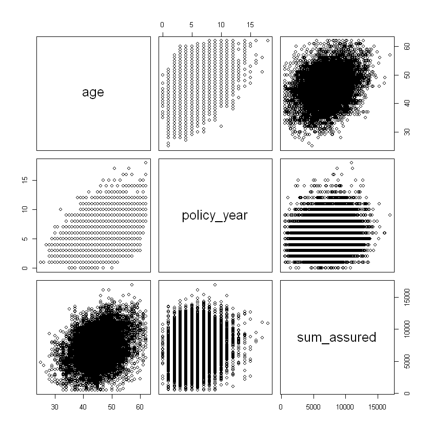
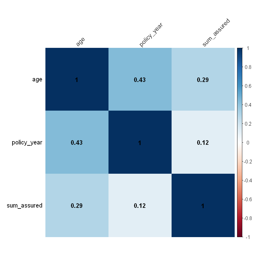
the correlation of ordered numerical rating factors: age and sum assured as well as age and policy year are positively correlated.
Data might need to be transformed in order to make the data more suitable to the assumptions within the model. Not considered here.
Look at distribution by single rating factors.
Benefit period mix#
df %>% count(benefit_period, wt = NULL, sort = TRUE) %>%
mutate(freq = percent(round(n / sum(n),2))) %>%
format(n, big.mark=",")
| benefit_period | n | freq |
|---|---|---|
| a65 | 456,552 | 76% |
| 2yr | 72,159 | 12% |
| 5yr | 71,289 | 12% |
Waiting period mix#
df %>% count(waiting_period, wt = NULL, sort = TRUE) %>%
mutate(freq = percent(round(n / sum(n),2))) %>%
format(n, big.mark=",")
| waiting_period | n | freq |
|---|---|---|
| 14d | 420,009 | 70.0% |
| 90d | 90,717 | 15.0% |
| 720d | 65,814 | 11.0% |
| 30d | 23,460 | 4.0% |
Occupation mix#
df %>% count(occupation, wt = NULL, sort = TRUE) %>%
mutate(freq = percent(round(n / sum(n),2))) %>%
format(n, big.mark=",")
| occupation | n | freq |
|---|---|---|
| sed | 240,348 | 40% |
| techn | 120,717 | 20% |
| white | 119,847 | 20% |
| blue | 59,613 | 10% |
| prof | 59,475 | 10% |
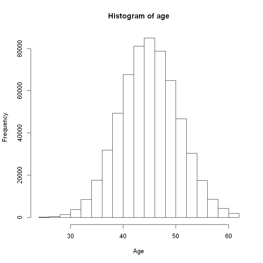
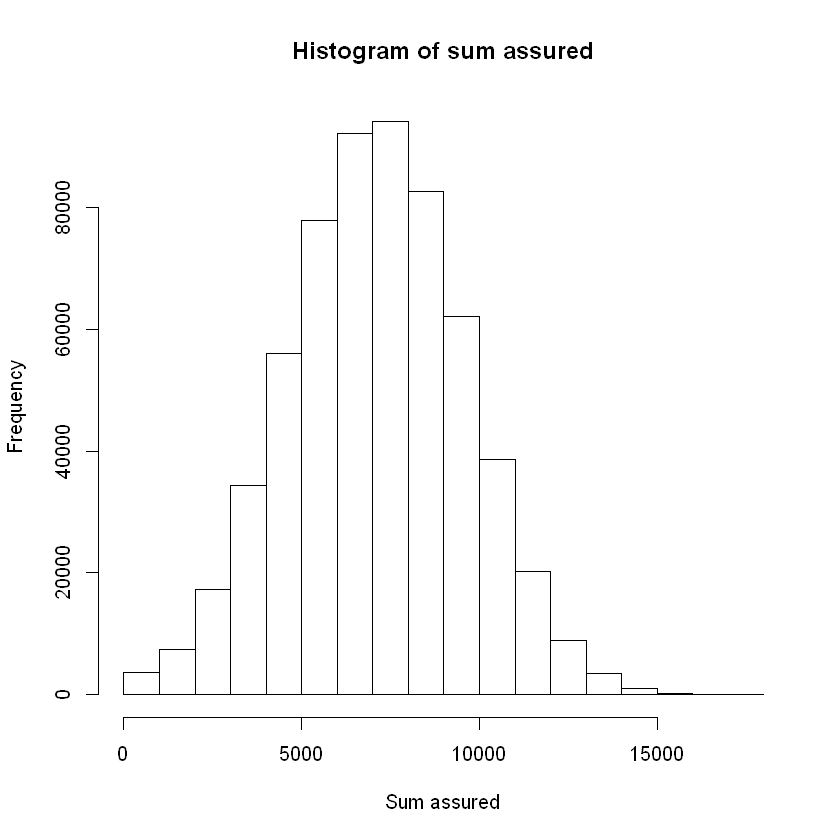
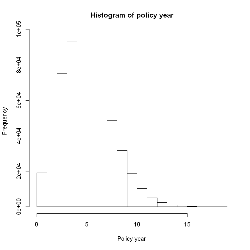
Consider a histogram to show the distribution of numeric data.
hist(df$age, main = "Histogram of age", xlab = "Age", ylab = "Frequency")
hist(df$sum_assured, main = "Histogram of sum assured", xlab = "Sum assured", ylab = "Frequency")
hist(df$policy_year, main = "Histogram of policy year", xlab = "Policy year", ylab = "Frequency")
Consider the correlation of ordered numeric explanatory variables.
# correlation of ordered numeric explanatory variables
# pairs() gives correlation matrix and plots; test on a random sample from our data
df_sample <- sample_n(df,10000,replace=FALSE)
df_sample %>% select(age,policy_year,sum_assured) %>% pairs
# or cor() to return just the correlation matrix
cor <-df_sample %>% select(age,policy_year,sum_assured) %>% cor
cor
# corrplot() is an alternative to visualise a correlation matrix
corrplot(cor,
addCoef.col = "black", # add coefficient of correlation
method="color",
sig.level = 0.01, insig = "blank",
tl.col="black", # tl stands for text label
tl.srt=45
)
| age | policy_year | sum_assured | |
|---|---|---|---|
| age | 1.0000000 | 0.4333434 | 0.2937906 |
| policy_year | 0.4333434 | 1.0000000 | 0.1249400 |
| sum_assured | 0.2937906 | 0.1249400 | 1.0000000 |
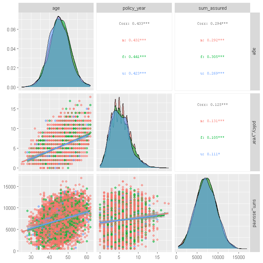
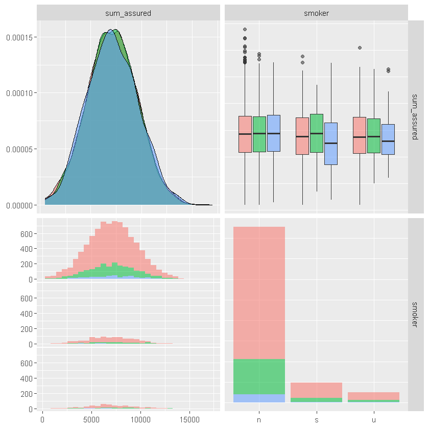
ggpairs() similarly shows correlations for ordered numeric data as well as other summary stats:
#ggpairs() similarly shows correlations for ordered numeric data as well as other summary stats
df_sample %>% select(age,policy_year,sum_assured,sex, smoker) %>%
ggpairs(columns = 1:3, aes(color = sex, alpha = 0.5),
upper = list(continuous = wrap("cor", size = 2.5)),
lower = list(continuous = "smooth"))
df_sample %>% select(age,policy_year,sum_assured,sex, smoker) %>%
ggpairs(columns = c("sum_assured", "smoker"), aes(color = sex, alpha = 0.5))
`stat_bin()` using `bins = 30`. Pick better value with `binwidth`.
Review summary statistics for subsets of data.
head(aggregate(df$sum_assured~df$age,data=df,mean))
| df$age | df$sum_assured |
|---|---|
| 25 | 3584.319 |
| 26 | 4431.558 |
| 27 | 4735.551 |
| 28 | 5066.777 |
| 29 | 5068.259 |
| 30 | 5204.272 |
Data format#
There are two main formats for structured data - long and wide. For regression, the structure of data informs the model structure. For counts data:
the long format corresponds to Bernoulli (claim or no claim for each observation) and allows for predictor variables by observation;
the wide format correspond to Binomial (count of claims per exposure). Wide format structures can include matrix of successes and failures or a proportion of successes and corresponding weights / number of observations/exposure for each line.
There are several tidyverse functions that can help with restructuring data, for example, convert data into wide format e.g.separate into a separate column for each value of sex:
Wide data format example#
head(spread(df_sample, sex, inc_count_tot, fill = 0))
| id | cal_year | policy_year | smoker | benefit_period | waiting_period | occupation | age | sum_assured | inc_sick_expected | ... | inc_count_sick | inc_count_acc | inc_amount_sick | inc_amount_acc | inc_amount_tot | imputed_age | missing_age | m | f | u |
|---|---|---|---|---|---|---|---|---|---|---|---|---|---|---|---|---|---|---|---|---|
| 186530 | 2019 | 6 | n | a65 | 14d | sed | 45 | 7850 | 0.004401375 | ... | 0 | 0 | 0 | 0 | 0 | 45 | 0 | 0 | 0 | 0 |
| 89986 | 2020 | 4 | n | a65 | 14d | techn | 48 | 8359 | 0.005302440 | ... | 0 | 0 | 0 | 0 | 0 | 48 | 0 | 0 | 0 | 0 |
| 12688 | 2019 | 6 | n | 5yr | 14d | white | 48 | 9391 | 0.005832684 | ... | 0 | 0 | 0 | 0 | 0 | 48 | 0 | 0 | 0 | 0 |
| 16974 | 2019 | 6 | s | a65 | 14d | white | 49 | 2687 | 0.008345518 | ... | 0 | 0 | 0 | 0 | 0 | 49 | 0 | 0 | 0 | 0 |
| 70839 | 2020 | 7 | n | a65 | 14d | prof | 41 | 3597 | 0.002475770 | ... | 0 | 0 | 0 | 0 | 0 | 41 | 0 | 0 | 0 | 0 |
| 120872 | 2018 | 4 | n | a65 | 14d | prof | 46 | 5177 | 0.004021200 | ... | 0 | 0 | 0 | 0 | 0 | 46 | 0 | 0 | 0 | 0 |
gather() converts data into long format; also pivot_longer() and pivot_wider().
Visualisation methods#
Introduction to ggplot#
This section sets out some simple visualisation methods using ggplot(). ggplot() Initializes a ggplot object. It can be used to declare the input data frame for a graphic and to specify the set of plot aesthetics intended to be common throughout all subsequent layers unless specifically overridden. The form of ggplot is:
ggplot(data = df, mapping = aes(x,y, other aesthetics), ...)
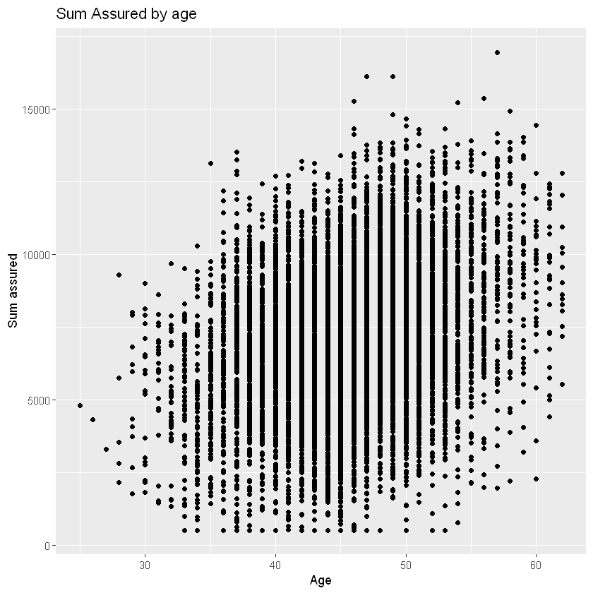
Examples below use ggplot to explore the exposure data.
# data argument passes the data frame to be visualised
# mapping argument defines a list of aesthetics for the visualisation - all subsequent layers use those unless overridden
# typically, the dependent variable is mapped onto the the y-axis and the independent variable is mapped onto the x-axis.
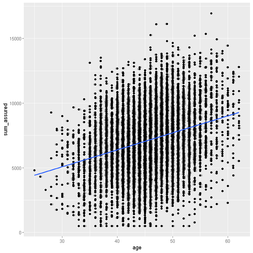
ggplot(data=df_sample, mapping=aes(x=age, y=sum_assured)) + # the '+' adds the layer below
# add subsequent visualisation layers, e.g. geom_point() for scatterplot
geom_point() +
# add a layer to change axis labels
# could add a layer to specify axis limits with ylim() and xlim()
labs(x="Age", y="Sum assured", title = "Sum Assured by age")
Layers#
The aesthetics input has a number of different options, for example x and y (axes), colour, size, fill, labels, alpha (transparency), shape, line type / width. You can change the aesthetics of each layer or default to the base layer. You can change the general look and feel of charts with a themes layer e.g. colour palette (see more in the next section).
You can add more layers to the base plot, for example
Geometries (geom_), for example
point - scatterplot,
line,
histogram,
bar/ column,
boxplot,
density,
jitter - adds random noise to separate points,
count - counts the number of observations at each location, then maps the count to point area,
abline - adds a reference line - vertical, horizontal or diagonal,
curve - adds a curved line to the chart between specified points,
text - add a text layer to label data points.
Statistics (stat_)
smooth (curve fitted to the data),
bin (e.g. for histogram).
A note on overlapping points: these can be adjusted for by adding noise and transparency to your points:
within an existing geom e.g. geom_point(position=”*”) with options including: identity (default = position is as per data), dodge (dodge overlapping objects side-to-side), jitter (random noise), jitterdodge, and nudge (nudge points a fixed distance) e.g. geom_bar(position = “dodge”) or geom_bar(position=position_dodge(width=0.2)).
or use geom_* with arguments e.g. geom_jitter(alpha = 0.2, shape=1). Shape choice might help, shape = 1 gives hollow circles.
Or alternatively count overlapping points with geom_count().
A full list of layers is available here.
ggplot(data=df_sample, aes(x=age, y=sum_assured)) +
geom_point() +
# separate overlapping points
geom_jitter(alpha = 0.2, width = 0.2) +
# add a smoothing line
geom_smooth(method = "glm", se=FALSE)
`geom_smooth()` using formula 'y ~ x'
Themes#
You can add a themes layer to your graph (ggplot_themes), for example
theme_gray() |Gray background and white grid lines.
theme_bw() |White background and gray grid lines.
theme_linedraw() |A theme with only black lines of various widths on white backgrounds.
theme_light() |A theme similar to theme_linedraw() but with light grey lines and axes, to direct more attention towards the data.
theme_dark() |Similar to theme_light() but with a dark background.
Others |e.g. theme_minimal() and theme_classic()
Other packages like ggthemes carry many more options. Example of added themes layer below. See also these examples these examples from ggthemes.
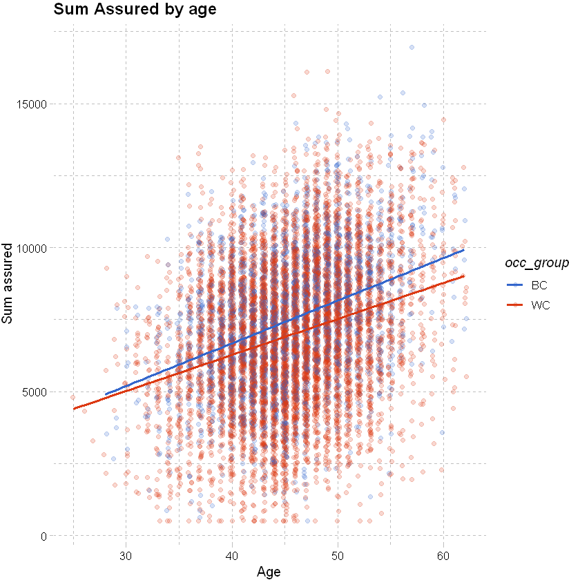
# add an occupation group to the data
df_sample <- df_sample %>% mutate(occ_group = factor(case_when(occupation %in% c("white","prof","sed") ~ "WC", TRUE ~ "BC")))
# vary colour by occupation
ggplot(data=df_sample, aes(x=age, y=sum_assured, color=occ_group)) +
# jitter and fit a smoothed line as below
geom_jitter(alpha = 0.2, width = 0.2) +
geom_smooth(method = "glm", se=FALSE) +
# add labels
labs(x="Age", y="Sum assured", title = "Sum Assured by age") +
# adding theme and colour palette layers
theme_pander() + scale_color_gdocs()
`geom_smooth()` using formula 'y ~ x'
3D visualisations with plotly#
ggplot does not cater to 3D visualisations, but this can be done through plotly simply.
plot_base <- plot_ly(data=df_sample, z= ~sum_assured, x= ~age, y=~policy_year, opacity=0.6) %>%
add_markers(color = ~occ_group,colors= c("blue", "red"), marker=list(size=2))
# show graph
# plot_base
# show graph in Jupyter notebooks
embed_notebook(plot_base)
We can add a modeled outcome to the 3D chart. For detail on the model fit, see later sections.
# to add a plane we need to define the points on the plane. To do that, we first create a grid of x and y values, where x and y are defined as earlier.
x_grid <- seq(from = min(df_sample$age), to = max(df_sample$age), length = 50)
y_grid <- seq(from = min(df_sample$policy_year), to = max(df_sample$policy_year), length = 50)
# create a simple model and extract the coefficient estimates
coeff_est <- glm(sum_assured ~ age + policy_year + occ_group,family="gaussian",data=df_sample) %>% coef()
# extract fitted values for z - here we want fitted values for BC and WC separately, use levels to determine how the model orders the factor occ_group
fitted_values_BC <- crossing(y_grid, x_grid) %>% mutate(z_grid = coeff_est[1] + coeff_est[2]*x_grid + coeff_est[3]*y_grid)
fitted_values_WC <- crossing(y_grid, x_grid) %>% mutate(z_grid = coeff_est[1] + coeff_est[2]*x_grid + coeff_est[3]*y_grid + coeff_est[4])
# convert to matrix
z_grid_BC <- fitted_values_BC %>% pull(z_grid) %>% matrix(nrow = length(x_grid)) %>% t()
z_grid_WC <- fitted_values_WC %>% pull(z_grid) %>% matrix(nrow = length(x_grid)) %>% t()
# define solid colours for the two planes / surfaces
colorscale_BC = list(c(0, 1), c("red", "red"))
colorscale_WC = list(c(0, 1), c("blue", "blue"))
# use plot base created above, add a surface for BC sum assureds and WC sum assureds
plot_base %>%
add_surface(x = x_grid, y = y_grid, z = z_grid_BC, showscale=FALSE, colorscale=colorscale_BC) %>%
add_surface(x = x_grid, y = y_grid, z = z_grid_WC, showscale=FALSE, colorscale=colorscale_WC) %>%
# filtering sum assured on a narrower range
layout(scene = list(zaxis = list(range=c(4000,12000))))
Review claim data#
Consider claim vs no claim. should be close to nil overlapping clams. actual claim rate is ~0.003-0.005.
df %>% select(inc_count_acc,inc_count_sick) %>% table()
inc_count_sick
inc_count_acc 0 1
0 596750 2087
1 1163 0
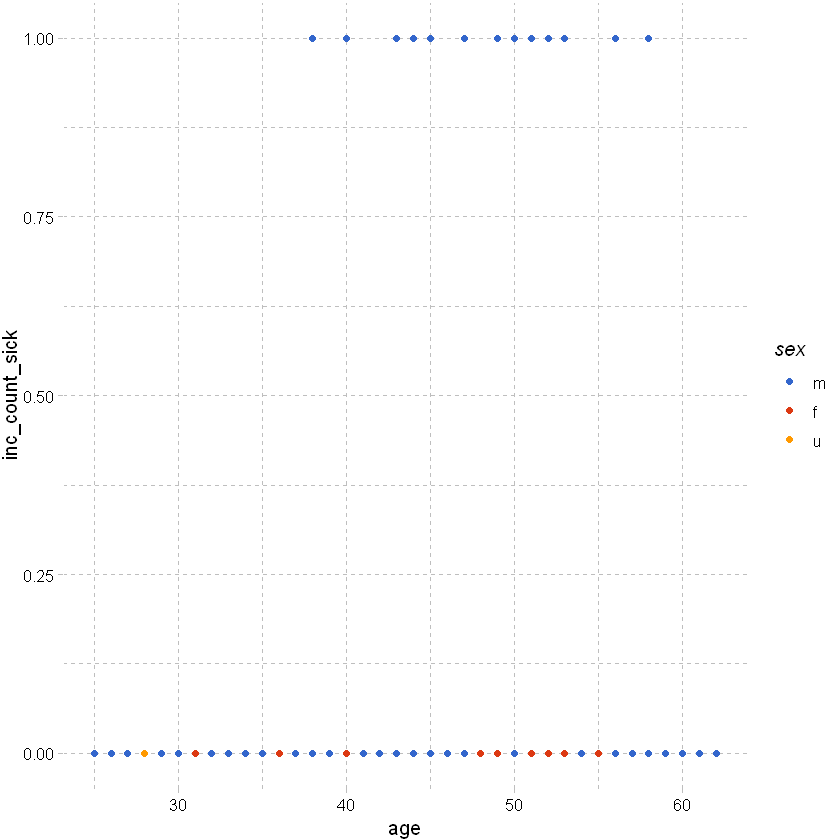
Plotting claim vs no claim by age and sex:
# use ggplot to plot inc_count_sick by age and sex; using df_sample from earlier
# clearly all of the points are going to be at 0 or 1 and will overlap at each age -> not useful.
df_sample %>% ggplot(aes(x=age,y=inc_count_sick,color=sex)) +
geom_point() +
theme_pander() + scale_color_gdocs()
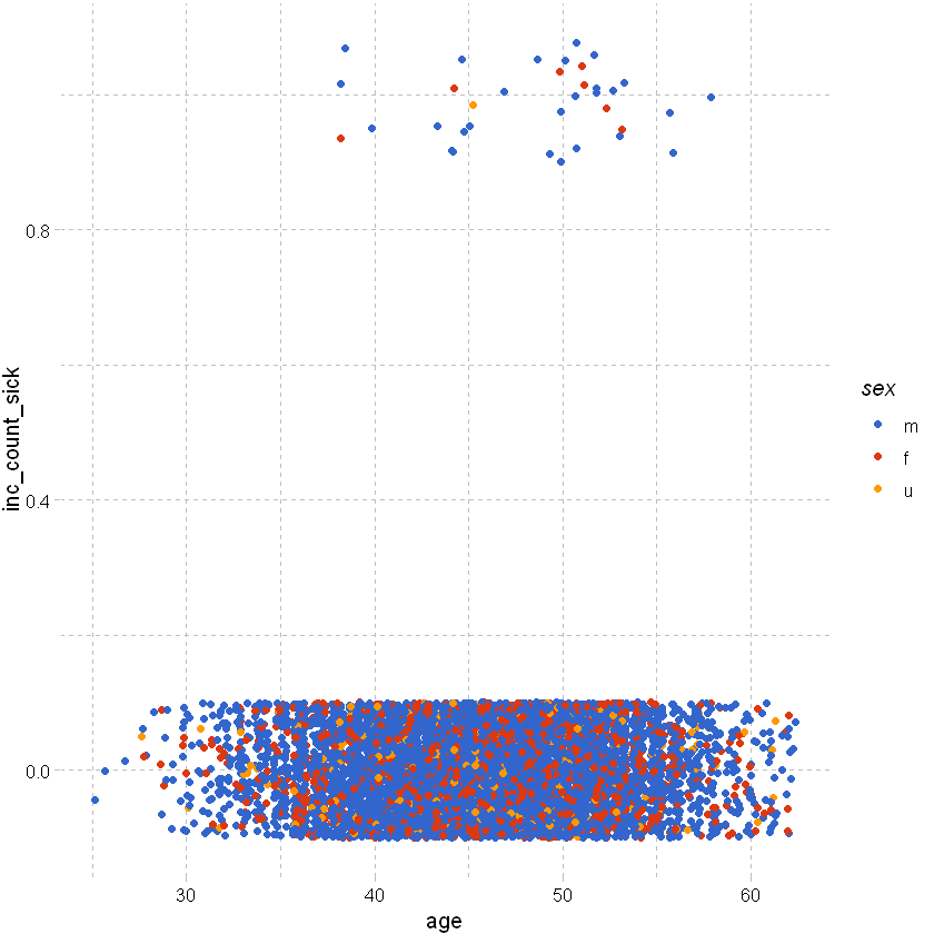
As above but add some random noise around the points to separate them:
df_sample %>% ggplot(aes(x=age,y=inc_count_sick,color=sex)) +
geom_point(position=position_jitter(height=0.1)) +
theme_pander() + scale_color_gdocs()
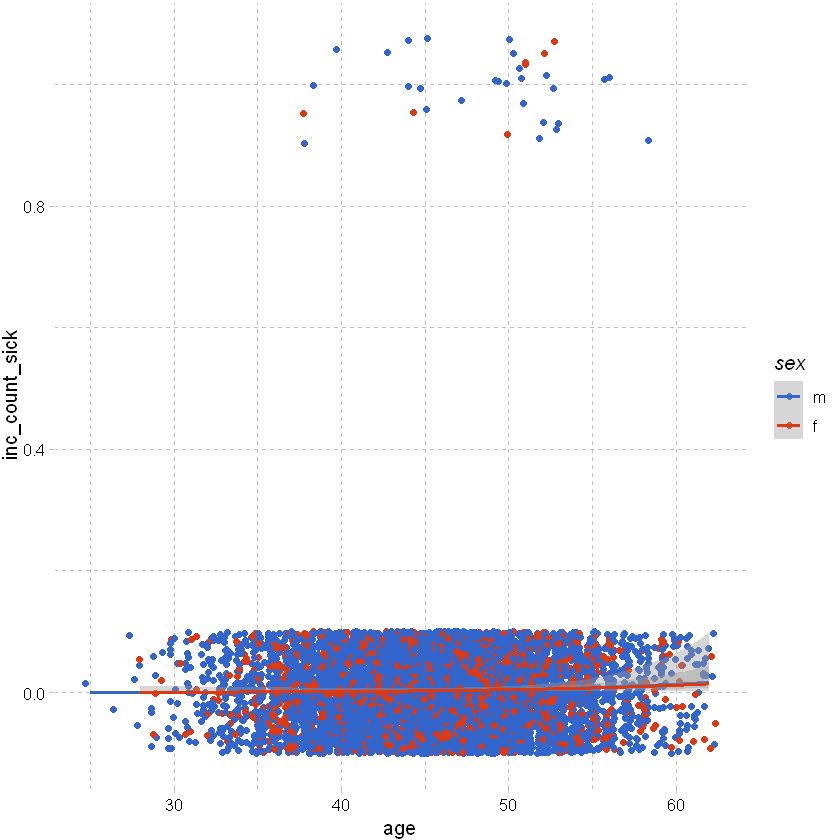
As above but excluding unknown sex and adding a smoothing line:
# as above but excluding unknown sex (as there are very few claims observed for that group) and adding a smoothing line (setting method as glm)
# because the claim rate is so low, the smoothed line is very close to zero and so not a particularly useful visualisation.
df_sample %>% filter(sex != "u") %>% ggplot(aes(x=age,y=inc_count_sick,color=sex)) +
geom_point(position=position_jitter(height=0.1)) +
geom_smooth(method="glm", method.args = list(family = "binomial")) + # or list(family = binomial(link='logit')
theme_pander() + scale_color_gdocs()
`geom_smooth()` using formula 'y ~ x'
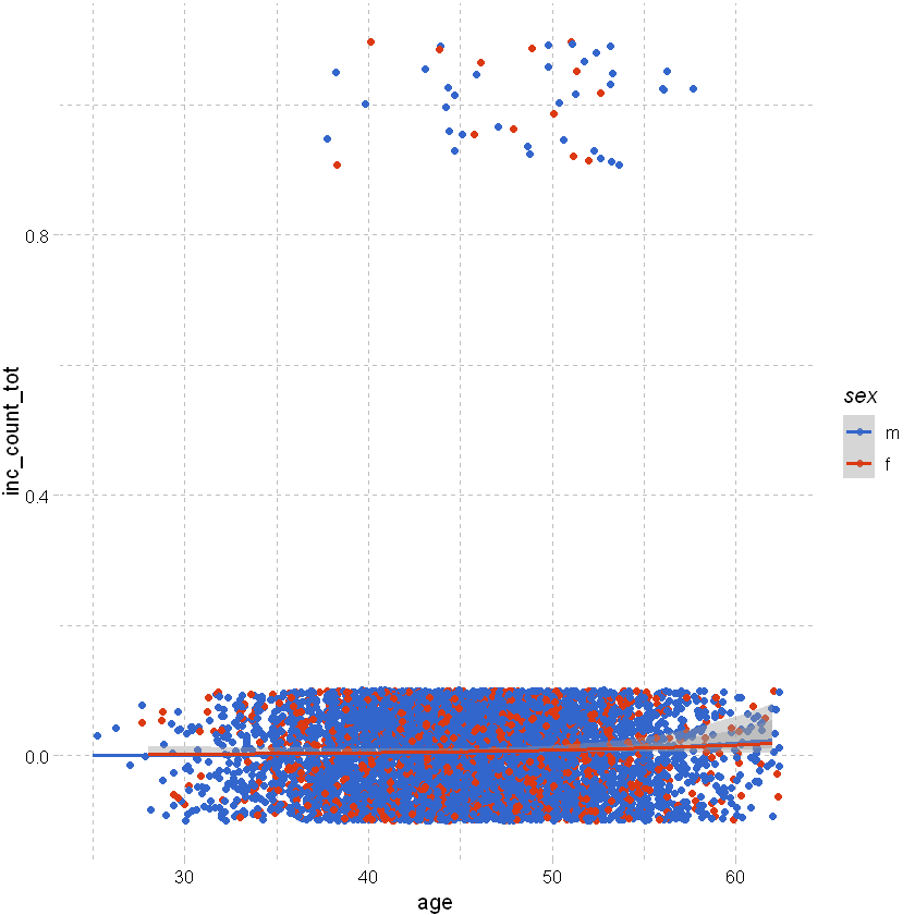
Looking at total count of claim rather than just sickness shows a slight trend by age:
df_sample %>% filter(sex != "u") %>% ggplot(aes(x=age,y=inc_count_tot,color=sex)) +
geom_point(position=position_jitter(height=0.1)) +
geom_smooth(method="glm", method.args = list(family = "binomial")) + # or list(family = binomial(link='logit')
theme_pander() + scale_color_gdocs()
`geom_smooth()` using formula 'y ~ x'
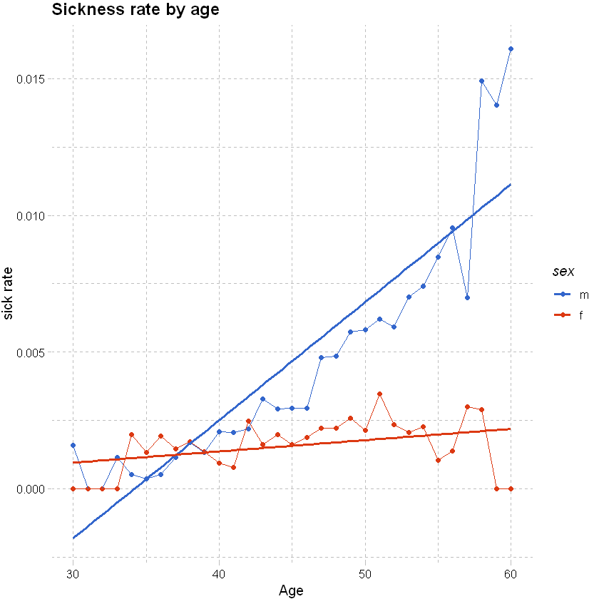
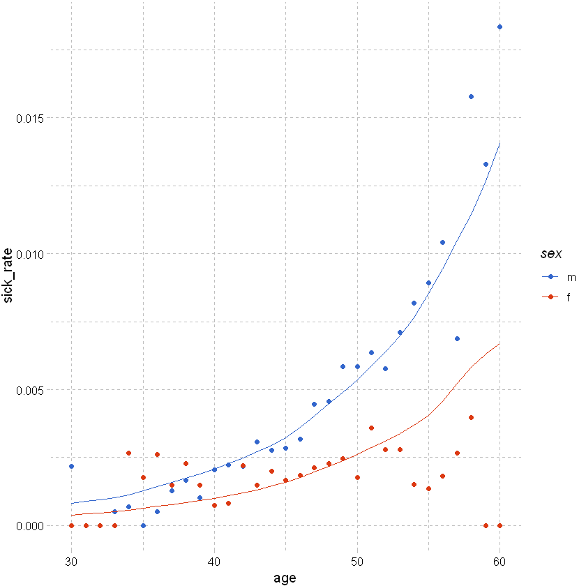
Consider claim rate:
# given the actual count of claims is so low, it might be more useful to consider the claim rate
# use the manipulation methods from earlier to get claim rates by age and sex for accident and sickness; filter out unknown sex and age with low exposure
# this shows a clear trend by age for males and females
df_grouped <- df %>% filter(sex != "u", between(age, 30,60)) %>% group_by(age,sex) %>% summarise(total_sick=sum(inc_count_sick),total_acc=sum(inc_count_acc), exposure=n(),.groups = 'drop') %>%
mutate(sick_rate = total_sick/exposure, acc_rate = total_acc/exposure)
# used ggplot to graph the results
df_grouped %>%
ggplot(aes(x=age,y=sick_rate,color=sex)) +
geom_point() +
geom_line() +
# add a smoothing line
geom_smooth(method = 'glm',se=FALSE) +
# add labels and themes
labs(x="Age", y="sick rate", title = "Sickness rate by age") +
theme_pander() + scale_color_gdocs()
`geom_smooth()` using formula 'y ~ x'
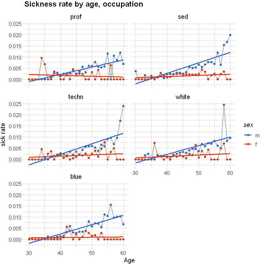
We can split the graph above into a few tiles to show the rates by other explanatory variables like occupation using facet_wrap; see also “facet_grid”. Can use grid.arrange(plot_1,plot_2, plot_3) from the pdp package to arrange unrelated pplot items.
# as above, but adding occupation
df_grouped <- df %>% filter(sex != "u", between(age, 30,60)) %>% group_by(age,sex,occupation) %>% summarise(total_sick=sum(inc_count_sick),total_acc=sum(inc_count_acc), exposure=n(),.groups = 'drop') %>% mutate(sick_rate = total_sick/exposure, acc_rate = total_acc/exposure)
df_grouped %>%
# used ggplot to graph the results
ggplot(aes(x=age,y=sick_rate,color=sex)) +
geom_point() +
geom_line() +
# add a smoothing line
geom_smooth(method = 'glm',se=FALSE) +
labs(x="Age", y="sick rate", title = "Sickness rate by age, occupation") +
theme_pander() + scale_color_gdocs() +
facet_wrap(~occupation, ncol=2, nrow=3)
`geom_smooth()` using formula 'y ~ x'
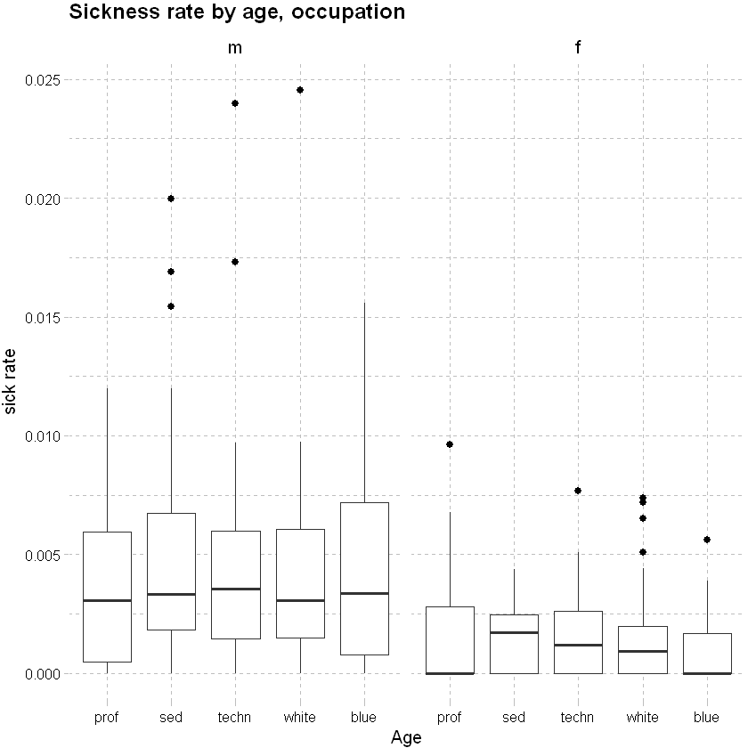
Consider sickness rate by occupation:
df_grouped %>%
# used ggplot to graph the results
ggplot(aes(x=occupation,y=sick_rate)) +
geom_boxplot(outlier.colour="black", outlier.shape=16, outlier.size=2, notch=FALSE)+
# add a smoothing line
labs(x="Age", y="sick rate", title = "Sickness rate by age, occupation") +
theme_pander() + scale_color_gdocs() +
facet_wrap(~sex, ncol=2, nrow=3)
Model Selection#
The sections below provide a refresher on linear and logistic regression; some considerations for insurance data; model selection and testing model fit.
Splitting data#
Training vs testing data#
Split data into training and testing data sets. We will used 75% of the data for training and the rest for testing.
# Determine the number of rows for training
nrow(df)
# Create a random sample of row IDs
sample_rows <- sample(nrow(df),0.75*nrow(df))
# Create the training dataset
df_train <- df[sample_rows,]
# Create the test dataset
df_test <- df[-sample_rows,]
Class imbalance#
Looking at the random sample we have created, we have a significant imbalance between successes and failures.
df_train %>% select(inc_count_acc,inc_count_sick) %>% table()
inc_count_sick
inc_count_acc 0 1
0 447547 1574
1 879 0
Generally, “in insurance applications, the prediction of a claim or no claim on an individual policy is rarely the point of statistical modelling … The model is useful provided it explains the variability in claims behaviour, as a function of risk factors. ” (Piet de Jong, Gillian Z. Heller, 2008, p108-109). So, as long as we have sufficient actual claims to justify the level of predictor variables fitted to the model we should be ok.
However, in some cases where it is important to correctly predict the binary categorical response variable, we may need to create a sample that has a roughly equal proportion of classes (of successes and failures) and then fit our model to that data. E.g. where we are looking to accurately predict fraud within banking transactions data.
To do that we need to refine our sampling method
Down sampling: the majority class is randomly down sampled to be of the same size as the smaller class.
Up sampling: rows from the minority class (e.g. claim) are repeatedly sampled over and over until they reaches the same size as the majority class (not claim).
Hybrid sampling: artificial data points are generated and are systematically added around the minority class.
Showing a method for down sampling below - this is more useful for pure classification models; not that useful for insurance applications.
# Determine the number of rows for training
df_train_ds <- downSample(df_train,factor(df_train$inc_count_sick))
df_train_ds %>% select(inc_count_sick) %>% table()
.
0 1
1574 1574
Regression#
Background#
Linear regression is a method of modelling the relationship between a response (dependent variable) and one or more explanatory variables (predictors; independent variables). For a data set , the relationship between y, the response/ dependent variables and the vector of x’s, the explanatory variables, is linear of the form
\(y_{i} = \beta_{0} + \beta_{1}x_{i1} + ... + \beta_{p}x_{ip} + \epsilon_{i} = \mathbf{x}_{i}^t\mathbf{\beta} + \epsilon_{i}\), \(i = 1,...,n\)
Key assumptions
linearity - response is some linear combination of regression coefficients and explanatory variables
constant variance (homoskedastic) - variance of errors does not depend upon explanatory variables
errors are independent - response variables uncorrelated
explanatory variables are not perfectly co-linear
weak exogeneity - predictors treated as fixed / no measurement error.
Linear vs logistic regression#
Linear: Continuous response outcome i.e. predicting a continuous response / dependent variable using a set of explanatory variables
Logistic: Binary response outcome - straight line does not fit the data well. The predicted values are always between 0 and 1.
For logistic regression the log odds are linear. We can transform to odds ratios by taking the exponential of the coefficients or exp(coef(model)) - this shows the relative change to odds of the response variables, where
Odds-ratio = 1, the coefficient has no effect.
Odds-ratio is <1, the coefficient predicts a decreased chance of an event occurring.
Odds-ratio is >1, the coefficient predicts an increased chance of an event occurring.
Logistic regression for claims incidence#
A simple regression model is shown below. Interpreting co-efficients and other output:
Intercept - global intercept and reference intercepts for each group (reference intercept: + contract (y~x); or intercept for each group: y~x-1)
Slopes - other coefficients, estimates linear coefficient for continuous variable
Other output
Pr(>|z|)/ p value is the probability coefficient result you’re seeing happened due to random variation. Commonly a p-value of .05 or less is significant.
AIC and likelihood tests, useful for model comparison.
Residuals sections gives summary stats of the model.
Call gives the form of the model.
vcov(model) gives the variance-covariance matrix for fitted model (diagonals are variance and off diagonals are covariance - 0 if all variables are orthogonal).
coef(model) returns the model coefficients.
model_1 <- glm(inc_count_sick~age,data=df_train,family="binomial") # use the default link
summary(model_1)
Call:
glm(formula = inc_count_sick ~ age, family = "binomial", data = df_train)
Deviance Residuals:
Min 1Q Median 3Q Max
-0.1719 -0.0925 -0.0764 -0.0662 3.8636
Coefficients:
Estimate Std. Error z value Pr(>|z|)
(Intercept) -10.143801 0.221246 -45.85 <2e-16 ***
age 0.095743 0.004542 21.08 <2e-16 ***
---
Signif. codes: 0 '***' 0.001 '**' 0.01 '*' 0.05 '.' 0.1 ' ' 1
(Dispersion parameter for binomial family taken to be 1)
Null deviance: 20946 on 449999 degrees of freedom
Residual deviance: 20499 on 449998 degrees of freedom
AIC: 20503
Number of Fisher Scoring iterations: 9
Choice of link function: the link function defines the relationship of response variables to mean. It is usually sufficient to use the standard link. Section below shows a model with the link specified (results are the same as the model above).
model_2 <- glm(inc_count_sick~age,data=df_train,family=binomial(link="logit")) # specify the link, logit is default for binomial
summary(model_2)
Adding more response variables: When deciding on explanatory variables to model, consider the properties of the data (like correlation or colinearity).
model_3 <- glm(inc_count_sick~age+policy_year+sex+waiting_period,data=df_train,family=binomial(link="logit"))
summary(model_3)
Call:
glm(formula = inc_count_sick ~ age + policy_year + sex + waiting_period,
family = binomial(link = "logit"), data = df_train)
Deviance Residuals:
Min 1Q Median 3Q Max
-0.2363 -0.0979 -0.0751 -0.0522 4.0480
Coefficients:
Estimate Std. Error z value Pr(>|z|)
(Intercept) -9.507516 0.247391 -38.431 < 2e-16 ***
age 0.092744 0.005108 18.155 < 2e-16 ***
policy_year 0.012077 0.010813 1.117 0.26402
sexf -0.723963 0.080513 -8.992 < 2e-16 ***
sexu -0.392234 0.133309 -2.942 0.00326 **
waiting_period14d -0.225423 0.107046 -2.106 0.03522 *
waiting_period720d -1.831494 0.184362 -9.934 < 2e-16 ***
waiting_period90d -1.590302 0.155151 -10.250 < 2e-16 ***
---
Signif. codes: 0 '***' 0.001 '**' 0.01 '*' 0.05 '.' 0.1 ' ' 1
(Dispersion parameter for binomial family taken to be 1)
Null deviance: 20946 on 449999 degrees of freedom
Residual deviance: 20032 on 449992 degrees of freedom
AIC: 20048
Number of Fisher Scoring iterations: 9
Linear regression for claims incidence#
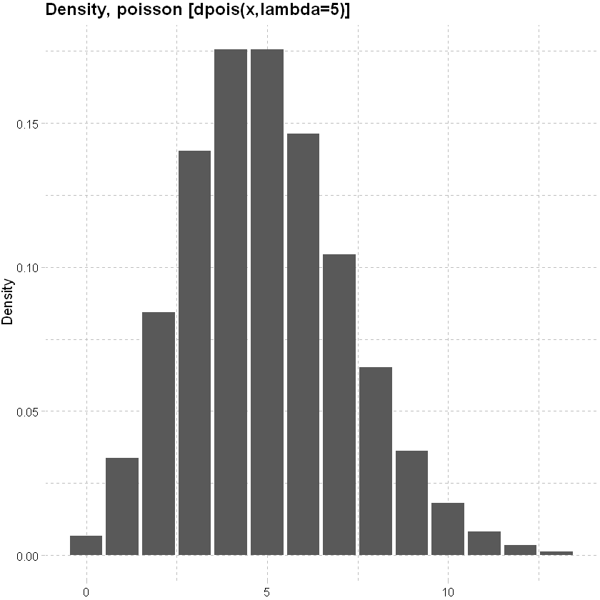
Choice of response distribution: In the logistic regression example above we considered the Binomial response distribution. Other common count distributions are
Poisson distribution: mean and variance are equal.
lower<-qpois(0.001, lambda=5)
upper<-qpois(0.999, lambda=5)
x<-seq(lower,upper,1)
data.frame(x, y=dpois(x, lambda=5)) %>% ggplot(mapping=aes(y=y,x=x)) + geom_col()+
labs(x=NULL, y="Density", title = "Density, poisson [dpois(x,lambda=5)]")+
theme_pander() + scale_color_gdocs()
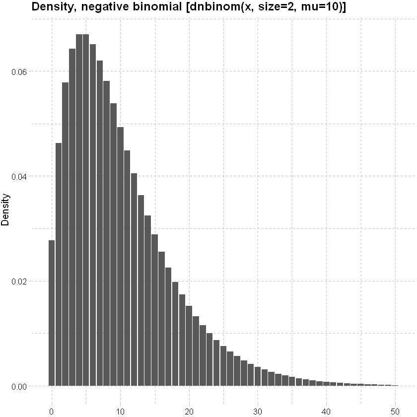
Negative Binomial distribution: can handle Poission overdispersion (where the variance is bigger than expected).
lower<-qnbinom(0.001, size=2, mu=10)
upper<-qnbinom(0.999, size=2, mu=10)
x<-seq(lower,upper,1)
data.frame(x, y=dnbinom(x, size=2, mu=10)) %>% ggplot(mapping=aes(y=y,x=x)) + geom_col()+
labs(x=NULL, y="Density", title = "Density, negative binomial [dnbinom(x, size=2, mu=10)]")+
theme_pander() + scale_color_gdocs()
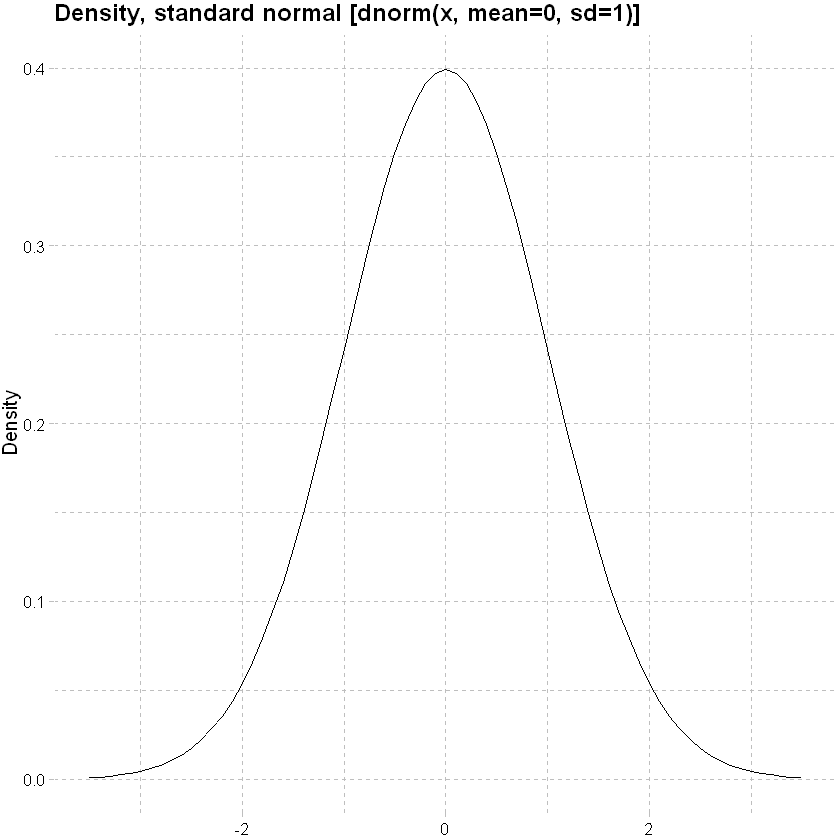
And amount
Normal distribution
x<-seq(-3.5,3.5,0.1)
data.frame(x,y=dnorm(x, mean=0, sd=1)) %>% ggplot(mapping=aes(y=y,x=x)) + geom_line()+
labs(x=NULL, y="Density", title = "Density, standard normal [dnorm(x, mean=0, sd=1)]")+
theme_pander() + scale_color_gdocs()
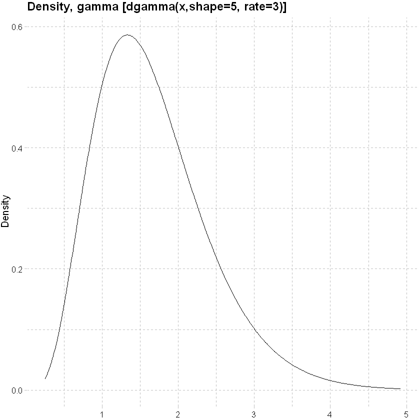
Gamma distribution: allows for a fatter tail.
lower<-qgamma(0.001, shape=5, rate=3)
upper<-qgamma(0.999, shape=5, rate=3)
x<-seq(lower,upper,0.01)
data.frame(x,y=dgamma(x, shape=5, rate=3)) %>% ggplot(mapping=aes(y=y,x=x)) + geom_line()+
labs(x=NULL, y="Density", title = "Density, gamma [dgamma(x,shape=5, rate=3)]")+
theme_pander() + scale_color_gdocs()
An example of an amount model, assuming a normal response distribution
amount_model_3 <- glm(inc_amount_sick~age+sex+waiting_period,data=df_train)
tidy(amount_model_3)
| term | estimate | std.error | statistic | p.value |
|---|---|---|---|---|
| (Intercept) | -95.810430 | 6.8876922 | -13.910382 | 5.594916e-44 |
| age | 3.081006 | 0.1286303 | 23.952420 | 1.047357e-126 |
| sexf | -17.195838 | 1.7996082 | -9.555323 | 1.237833e-21 |
| sexu | -10.657062 | 3.3390695 | -3.191626 | 1.414840e-03 |
| waiting_period14d | -6.541216 | 3.7373400 | -1.750233 | 8.007880e-02 |
| waiting_period720d | -33.763676 | 4.2327865 | -7.976702 | 1.506444e-15 |
| waiting_period90d | -31.703813 | 4.0796954 | -7.771122 | 7.795662e-15 |
(Un)grouped data#
The models above were based upon ungrouped data, but earlier we noted that data are often grouped. In grouping data, some detail is usually lost e.g. we no longer have any true continuous categorical response variables. In this case, the columns relating to actual events (here claims) are a sum of the individual instance; more at (Piet de Jong, Gillian Z. Heller, 2008, p49, 105).
The example below compares a model of counts by age and sex on the grouped and shows that the derived parameters are materially similar.
Modeled result - grouped data#
# grouped model
model_4 <- glm(cbind(inc_count_sick,exposure-inc_count_sick)~age+sex,data=df_grp,family=binomial(link="logit")) # cbind gives a matrix of successes and failures
# use tidy to visualise the modelled result
tidy(model_4)
| term | estimate | std.error | statistic | p.value |
|---|---|---|---|---|
| (Intercept) | -9.82915098 | 0.19177695 | -51.253036 | 0.000000e+00 |
| age | 0.09184475 | 0.00394179 | 23.300262 | 4.406175e-120 |
| sexf | -0.74096991 | 0.07029043 | -10.541548 | 5.557637e-26 |
| sexu | -0.46113406 | 0.11882806 | -3.880683 | 1.041634e-04 |
Modeled result - ungrouped data#
# ungrouped model, coefficients materially similar
model_5 <- glm(inc_count_sick~age+sex,data=df,family=binomial(link="logit"))
tidy(model_5)
| term | estimate | std.error | statistic | p.value |
|---|---|---|---|---|
| (Intercept) | -9.82915098 | 0.191777745 | -51.252824 | 0.000000e+00 |
| age | 0.09184475 | 0.003941806 | 23.300170 | 4.415725e-120 |
| sexf | -0.74096991 | 0.070292033 | -10.541307 | 5.571897e-26 |
| sexu | -0.46113406 | 0.118830844 | -3.880592 | 1.042024e-04 |
Offsets#
When the data are grouped, it is important to consider the level of exposure in a given group. This can be achieved with an offset term (Piet de Jong, Gillian Z. Heller, 2008, p66-67). This is important in an insurance context where we are often interested in modelling rates of claim.
df_grp_filtered <- df_grp %>% filter(inc_count_tot>1, exposure>10)
model_6 <- glm(inc_amount_tot~age+sex+offset(sum_assured),data=df_grp_filtered)
tidy(model_6)
model_7 <- glm(inc_amount_tot~age+sex,data=df_grp_filtered)
tidy(model_7)
| term | estimate | std.error | statistic | p.value |
|---|---|---|---|---|
| (Intercept) | -3454136.9 | 526285.34 | -6.563240 | 2.386329e-10 |
| age | 50880.1 | 10976.25 | 4.635471 | 5.368643e-06 |
| sexf | 808044.4 | 134594.88 | 6.003530 | 5.699350e-09 |
| sexu | 1087955.5 | 542771.39 | 2.004445 | 4.594237e-02 |
| term | estimate | std.error | statistic | p.value |
|---|---|---|---|---|
| (Intercept) | 8153.3797 | 5656.7413 | 1.4413563 | 0.15055193 |
| age | 204.3921 | 117.9775 | 1.7324674 | 0.08424268 |
| sexf | -3453.6498 | 1446.6837 | -2.3872875 | 0.01760721 |
| sexu | -3801.3295 | 5833.9405 | -0.6515887 | 0.51517731 |
Actuals or AvE?#
The models we have fitted above are based upon actual claim incidences. We can consider the difference between some expected claim rate (e.g. from a standard table) and the actuals.
Using the grouped data again, we model A/E with a normal response distribution. The model shows that none of the coeffients are significant indicating no material difference to expected, which is consistent with the data as the observations were derived from the expected probabilities initially.
# grouped model
model_8 <- glm(inc_count_sick/inc_count_sick_exp~age+sex,data=df_grp)
# use tidy to visualise the modelled result
summary(model_8)
Call:
glm(formula = inc_count_sick/inc_count_sick_exp ~ age + sex,
data = df_grp)
Deviance Residuals:
Min 1Q Median 3Q Max
-1.19 -0.97 -0.93 -0.87 2571.52
Coefficients:
Estimate Std. Error t value Pr(>|t|)
(Intercept) 0.725747 0.456016 1.591 0.112
age 0.004747 0.009713 0.489 0.625
sexf -0.091246 0.154067 -0.592 0.554
sexu 0.174939 0.208211 0.840 0.401
(Dispersion parameter for gaussian family taken to be 514.2801)
Null deviance: 56358742 on 109589 degrees of freedom
Residual deviance: 56357894 on 109586 degrees of freedom
AIC: 995154
Number of Fisher Scoring iterations: 2
Stepwise regression#
This method builds a regression model from a set of candidate predictor variables by entering predictors based on p values, in a stepwise manner until there are no variables left to enter any more. Model may over / under-state the importance of predictors and the direction of stepping (forward or backward) can impact the outcome - so some degree of interpretation is necessary.
# specify a null model with no predictors
null_model_sick <- glm(inc_count_sick ~ 1, data = df_train, family = "binomial")
# specify the full model using all of the potential predictors
full_model_sick <- glm(inc_count_sick ~ cal_year + policy_year + sex + smoker + benefit_period + waiting_period + occupation + poly(age,3) + sum_assured + policy_year*age + policy_year*sum_assured, data = df_train, family = "binomial")
# alternatively, glm(y~ . -x1) fits model using all variables excluding x1
# use a forward stepwise algorithm to build a parsimonious model
step_model_sick <- step(null_model_sick, scope = list(lower = null_model_sick, upper = full_model_sick), direction = "forward")
summary(full_model_sick)
summary(step_model_sick)
Start: AIC=20948.4
inc_count_sick ~ 1
Df Deviance AIC
+ age 1 20499 20503
+ poly(age, 3) 3 20497 20505
+ waiting_period 3 20581 20589
+ policy_year 1 20833 20837
+ sum_assured 1 20842 20846
+ sex 2 20844 20850
+ smoker 2 20925 20931
+ cal_year 1 20932 20936
<none> 20946 20948
+ benefit_period 2 20945 20951
+ occupation 4 20941 20951
Step: AIC=20503.31
inc_count_sick ~ age
Df Deviance AIC
+ waiting_period 3 20135 20145
+ sex 2 20398 20406
+ smoker 2 20478 20486
+ sum_assured 1 20482 20488
<none> 20499 20503
+ policy_year 1 20498 20504
+ cal_year 1 20499 20505
+ poly(age, 3) 2 20497 20505
+ occupation 4 20494 20506
+ benefit_period 2 20498 20506
Step: AIC=20145.08
inc_count_sick ~ age + waiting_period
Df Deviance AIC
+ sex 2 20033 20047
+ smoker 2 20114 20128
+ sum_assured 1 20118 20130
<none> 20135 20145
+ policy_year 1 20134 20146
+ poly(age, 3) 2 20133 20147
+ cal_year 1 20135 20147
+ occupation 4 20129 20147
+ benefit_period 2 20134 20148
Step: AIC=20047.43
inc_count_sick ~ age + waiting_period + sex
Df Deviance AIC
+ smoker 2 20012 20030
+ sum_assured 1 20017 20033
<none> 20033 20047
+ policy_year 1 20032 20048
+ poly(age, 3) 2 20031 20049
+ cal_year 1 20033 20049
+ occupation 4 20028 20050
+ benefit_period 2 20032 20050
Step: AIC=20030.01
inc_count_sick ~ age + waiting_period + sex + smoker
Df Deviance AIC
+ sum_assured 1 19995 20015
<none> 20012 20030
+ policy_year 1 20011 20031
+ poly(age, 3) 2 20009 20031
+ cal_year 1 20012 20032
+ occupation 4 20006 20032
+ benefit_period 2 20011 20033
Step: AIC=20015.39
inc_count_sick ~ age + waiting_period + sex + smoker + sum_assured
Df Deviance AIC
<none> 19995 20015
+ policy_year 1 19994 20016
+ poly(age, 3) 2 19993 20017
+ cal_year 1 19995 20017
+ benefit_period 2 19994 20018
+ occupation 4 19995 20023
Call:
glm(formula = inc_count_sick ~ cal_year + policy_year + sex +
smoker + benefit_period + waiting_period + occupation + poly(age,
3) + sum_assured + policy_year * age + policy_year * sum_assured,
family = "binomial", data = df_train)
Deviance Residuals:
Min 1Q Median 3Q Max
-0.2568 -0.0983 -0.0740 -0.0512 4.0416
Coefficients: (1 not defined because of singularities)
Estimate Std. Error z value Pr(>|z|)
(Intercept) -4.710e+01 6.626e+01 -0.711 0.47714
cal_year 2.058e-02 3.283e-02 0.627 0.53070
policy_year -1.077e-01 1.018e-01 -1.058 0.28991
sexf -7.244e-01 8.052e-02 -8.997 < 2e-16 ***
sexu -3.912e-01 1.333e-01 -2.934 0.00334 **
smokers 3.464e-01 7.424e-02 4.666 3.07e-06 ***
smokeru -1.076e-01 1.239e-01 -0.869 0.38493
benefit_period2yr -9.245e-02 8.108e-02 -1.140 0.25414
benefit_period5yr -3.854e-02 7.952e-02 -0.485 0.62796
waiting_period14d -2.306e-01 1.071e-01 -2.154 0.03121 *
waiting_period720d -1.837e+00 1.844e-01 -9.964 < 2e-16 ***
waiting_period90d -1.595e+00 1.552e-01 -10.281 < 2e-16 ***
occupationsed -2.305e-02 9.765e-02 -0.236 0.81336
occupationtechn -5.071e-02 1.022e-01 -0.496 0.61970
occupationwhite -6.020e-02 1.013e-01 -0.594 0.55238
occupationblue -3.262e-02 1.189e-01 -0.274 0.78383
poly(age, 3)1 3.006e+02 4.680e+01 6.423 1.34e-10 ***
poly(age, 3)2 -4.075e+01 2.723e+01 -1.497 0.13445
poly(age, 3)3 -7.897e+00 2.002e+01 -0.394 0.69328
sum_assured 4.281e-05 2.744e-05 1.560 0.11867
age NA NA NA NA
policy_year:age 2.424e-03 2.110e-03 1.149 0.25072
policy_year:sum_assured -4.251e-08 3.969e-06 -0.011 0.99145
---
Signif. codes: 0 '***' 0.001 '**' 0.01 '*' 0.05 '.' 0.1 ' ' 1
(Dispersion parameter for binomial family taken to be 1)
Null deviance: 20946 on 449999 degrees of freedom
Residual deviance: 19987 on 449978 degrees of freedom
AIC: 20031
Number of Fisher Scoring iterations: 9
Call:
glm(formula = inc_count_sick ~ age + waiting_period + sex + smoker +
sum_assured, family = "binomial", data = df_train)
Deviance Residuals:
Min 1Q Median 3Q Max
-0.2830 -0.0973 -0.0745 -0.0519 4.0246
Coefficients:
Estimate Std. Error z value Pr(>|z|)
(Intercept) -9.640e+00 2.432e-01 -39.635 < 2e-16 ***
age 8.953e-02 4.755e-03 18.829 < 2e-16 ***
waiting_period14d -2.295e-01 1.071e-01 -2.144 0.03202 *
waiting_period720d -1.835e+00 1.844e-01 -9.951 < 2e-16 ***
waiting_period90d -1.594e+00 1.552e-01 -10.273 < 2e-16 ***
sexf -7.238e-01 8.052e-02 -8.989 < 2e-16 ***
sexu -3.916e-01 1.333e-01 -2.937 0.00331 **
smokers 3.466e-01 7.424e-02 4.669 3.03e-06 ***
smokeru -1.067e-01 1.239e-01 -0.862 0.38885
sum_assured 4.333e-05 1.064e-05 4.072 4.66e-05 ***
---
Signif. codes: 0 '***' 0.001 '**' 0.01 '*' 0.05 '.' 0.1 ' ' 1
(Dispersion parameter for binomial family taken to be 1)
Null deviance: 20946 on 449999 degrees of freedom
Residual deviance: 19995 on 449990 degrees of freedom
AIC: 20015
Number of Fisher Scoring iterations: 9
The form of the final step model is glm(formula = inc_count_sick ~ poly(age, 3) + waiting_period + sex + smoker + sum_assured, family = “binomial”, data = df_train) i.e. dropping some of the explanatory variables from the full model.
Confidence intervals#
We can compute the confidence intervals for one or more parameters in a fitted model.
confint(step_model_sick) # add second argument specifying which parameters we need a confint for
Waiting for profiling to be done...
| 2.5 % | 97.5 % | |
|---|---|---|
| (Intercept) | -1.011939e+01 | -9.1658786725 |
| age | 8.021044e-02 | 0.0988490230 |
| waiting_period14d | -4.333078e-01 | -0.0131725684 |
| waiting_period720d | -2.205152e+00 | -1.4802247926 |
| waiting_period90d | -1.900406e+00 | -1.2909882621 |
| sexf | -8.848852e-01 | -0.5690645113 |
| sexu | -6.636738e-01 | -0.1401306177 |
| smokers | 1.985219e-01 | 0.4896777597 |
| smokeru | -3.586694e-01 | 0.1276681057 |
| sum_assured | 2.248727e-05 | 0.0000642007 |
Predictions#
predict() is a generic function that can be used to predict results from various model forms. The function takes the form below. For logistic regression, setting prediction type to response produces a probability rather than log odds (which are difficult to interpret).
# predictions
pred_inc_count_sick <- as.data.frame(
predict(step_model_sick, data= df_train, # model and data
type="response", # or terms for coefficients
se.fit = TRUE, # default is false
interval = "confidence", #default "none", also "prediction"
level = 0.95
# ...
)
)
# add back to data
ifrm("df_train_pred")
pred_inc_count_sick <- rename(pred_inc_count_sick,pred_rate_inc_count_sick=fit,se_rate_inc_count_sick=se.fit)
df_train_pred <- cbind(df_train,pred_inc_count_sick)
We can plot the results by age and sex against the crude rates from earlier:
# from earlier, summarise data by age and sex
df_train_pred %>% filter(sex != "u", between(age, 30,60)) %>% group_by(age,sex) %>%
summarise(total_sick=sum(inc_count_sick),total_acc=sum(inc_count_acc), pred_total_sick=sum(pred_rate_inc_count_sick),exposure=n(),.groups = 'drop') %>%
mutate(sick_rate = total_sick/exposure,pred_sick_rate = pred_total_sick/exposure, acc_rate = total_acc/exposure) %>%
# used ggplot to graph the results
ggplot(aes(x=age,y=sick_rate,color=sex)) +
# ylim(0,1) +
geom_point() +
# add a modeled line
geom_line(aes(x=age,y=pred_sick_rate)) +
theme_pander() + scale_color_gdocs()
Out of sample predictions#
Earlier we split the data into “training” data used to create the model and “test” data which we intended to use for performance validation. Adding predictions to test data below.
# predictions
pred_inc_count_sick <- as.data.frame(
predict(step_model_sick, data= df_test, # test data
type="response",
se.fit = TRUE,
interval = "confidence",
level = 0.95
# ...
)
)
# add back to data
ifrm("df_test_pred")
pred_inc_count_sick <- rename(pred_inc_count_sick,pred_rate_inc_count_sick=fit,se_rate_inc_count_sick=se.fit)
df_test_pred <- cbind(df_test,pred_inc_count_sick)
# summary stats for prediction
hist(df_test_pred$pred_rate_inc_count_sick,main = "Histogram of predicted sickness rate",xlab = "Probability of claim")
summary(df_test_pred$pred_rate_inc_count_sick)
Warning message in data.frame(..., check.names = FALSE):
"row names were found from a short variable and have been discarded"
Min. 1st Qu. Median Mean 3rd Qu. Max.
6.024e-05 1.363e-03 2.787e-03 3.498e-03 4.748e-03 3.925e-02
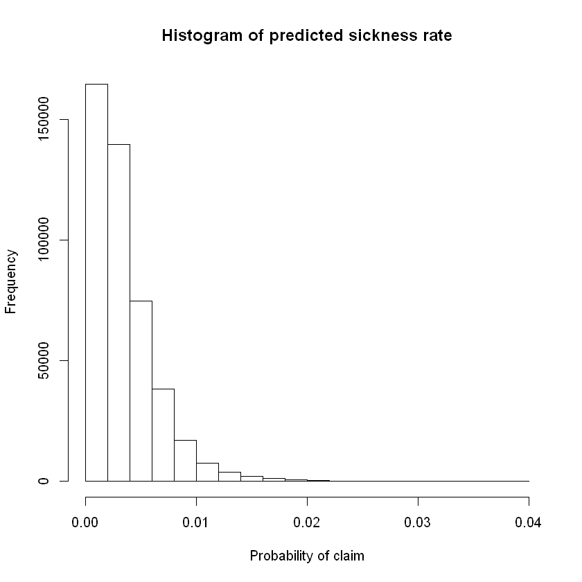
To translate the predicted probabilities into a vector of claim/no-claim for each policy we could define a claim as occurring if modelled / predicted probability of claim is greater than some threshold value. More on this later under evaluation techniques.
# add binary prediction based upon a threshold probability
df_test_pred$pred_inc_count_sick <- ifelse(df_test_pred$pred_rate_inc_count_sick>0.003,1,0) # example threshold is ~3rd quartile probability of claim. for balanced data this should be closer to 0.5.
Evaluation#
Techniques#
AIC#
For least squares regression the \(R^{2}\) statistic (coefficient of determination) measures the proportion of variance in the dependent variable that can be explained by the independent variables. Adjusted \(R^{2}\), adjusts for the number of predictors in the model. The adjusted \(R^{2}\) increases when the new predictor improves the model more than would be expected by chance. The glm function uses a maximum likelihood estimator which does not minimize the squared error.
AIC stands for Akaike Information Criteria. \(AIC = -2l+2p\) where \(l\) is the log likelihood and \(p\) are the number of parameters. It is analogous to adjusted \(R^{2}\) and is the measure of fit which penalizes model for the number of independent variables. We prefer a model with a lower AIC value.
Attaching package: 'MASS'
The following object is masked _by_ '.GlobalEnv':
select
The following object is masked from 'package:plotly':
select
The following object is masked from 'package:dplyr':
select
arm (Version 1.11-1, built: 2020-4-27)
Working directory is C:/Users/reenn/Documents/GitHub/cookbook/cookbook/docs
Attaching package: 'arm'
The following object is masked from 'package:corrplot':
corrplot
The following object is masked from 'package:scales':
rescale
The results below show the AIC for model 3 is lower than model 1 and that the final step model has the lowest AIC of those evaluated (preferred).
AIC(model_1)
AIC(model_3)
stepAIC(step_model_sick)
Start: AIC=20015.39
inc_count_sick ~ age + waiting_period + sex + smoker + sum_assured
Df Deviance AIC
<none> 19995 20015
- sum_assured 1 20012 20030
- smoker 2 20017 20033
- sex 2 20097 20113
- age 1 20352 20370
- waiting_period 3 20360 20374
Call: glm(formula = inc_count_sick ~ age + waiting_period + sex + smoker +
sum_assured, family = "binomial", data = df_train)
Coefficients:
(Intercept) age waiting_period14d waiting_period720d
-9.640e+00 8.953e-02 -2.295e-01 -1.835e+00
waiting_period90d sexf sexu smokers
-1.594e+00 -7.238e-01 -3.916e-01 3.466e-01
smokeru sum_assured
-1.067e-01 4.333e-05
Degrees of Freedom: 449999 Total (i.e. Null); 449990 Residual
Null Deviance: 20950
Residual Deviance: 20000 AIC: 20020
Anova#
An anova comparison below between model_3 and the step model using a Chi-squared test shows a small p value for the stepped model - indicating that the model is an improvement. F-test can be used on continuous response models.
anova(model_3,step_model_sick, test="Chisq")
| Resid. Df | Resid. Dev | Df | Deviance | Pr(>Chi) |
|---|---|---|---|---|
| 449992 | 20032.19 | NA | NA | NA |
| 449990 | 19995.39 | 2 | 36.79514 | 1.023381e-08 |
Likelihood ratio test#
The likelihood ratio test compares two models based upon log likelihoods; more at (Piet de Jong, Gillian Z. Heller, 2008, p74).
The test below concludes that the step model is more accurate than the less complex model.
lrtest(model_3,step_model_sick)
| #Df | LogLik | Df | Chisq | Pr(>Chisq) |
|---|---|---|---|---|
| 8 | -10016.095 | NA | NA | NA |
| 10 | -9997.697 | 2 | 36.79514 | 1.023381e-08 |
Other tests#
Other validations tests could be considered like the Wald test, Score test; see (Piet de Jong, Gillian Z. Heller, 2008, p74-77).
Residual checks#
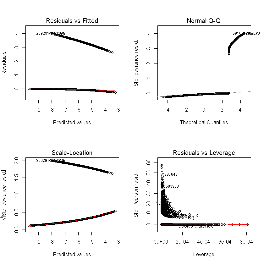
Residuals / errors are the observed less fitted values. Traditional residual plots (shown below) are usually a good starting point (we expect to see no trend in the plot of residuals vs fitted values), but are not as informative for logistic regression or for data with a low probability outcome.
Standard model plots#
Plots, linear regression example:
par(mfrow = c(2, 2))
plot(amount_model_3)
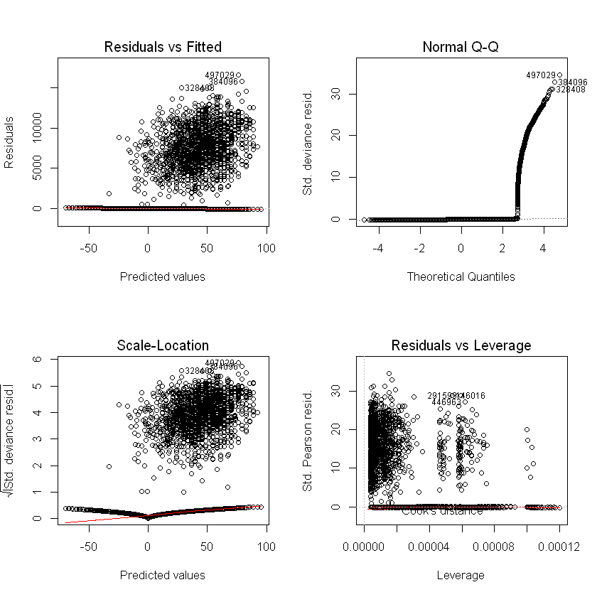
Logistic regression example:
par(mfrow = c(2, 2))
plot(step_model_sick)
Alternatives#
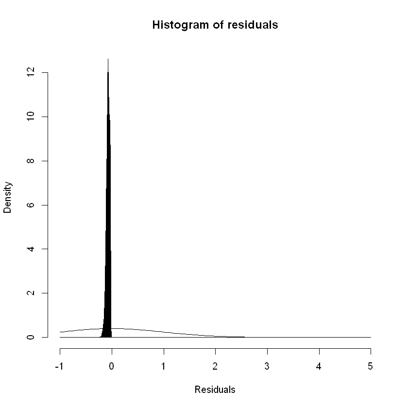
For logistic regression we can try other tools to test the residuals against the model assumptions. GLMs assume that the residuals / errors are normally distributed. Plotting the density of the residuals gives us:
hist(rstandard(step_model_sick),breaks= c(seq(-1,1,by=0.001),seq(2,5, by=1)),freq=FALSE,main = "Histogram of residuals",xlab = "Residuals")
curve(dnorm, add = TRUE)
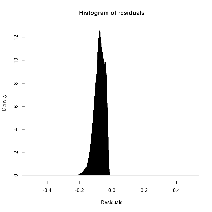
Focusing the x axis range:
hist(rstandard(step_model_sick),breaks= c(seq(-1,1,by=0.001),seq(2,5, by=1)), xlim = c(-0.5,0.5),freq=FALSE,main = "Histogram of residuals",xlab = "Residuals")
A binned residual plot divides data into bins based upon their fitted values, showing the average residuals vs fitted value for each bin (Jeff Webb, 2017):
# from the arm package
binnedplot(fitted(step_model_sick),
residuals(step_model_sick, type = "response"),
nclass = 50,
xlab = "Expected Values",
ylab = "Average residual",
main = "Binned residual plot",
cex.pts = 0.8,
col.pts = 1,
col.int = "gray")
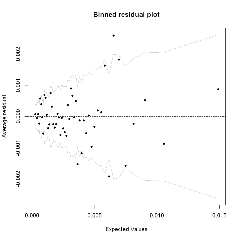
Grey lines are 2 se bands (~95%). Apart from a few outliers, most of the residuals are within those bands.
P-P plots#
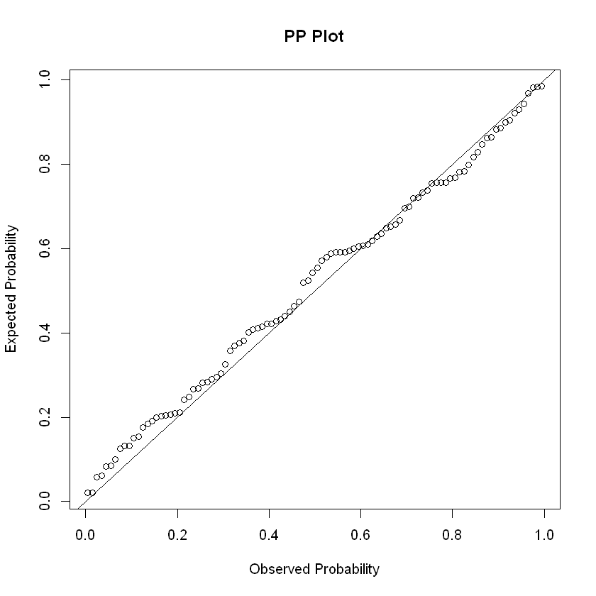
The P-P (probability–probability) plot is a visualization that plots CDFs of the two distributions (empirical and theoretical) against each other, an unrelated dummy example below. It can be used to assess the residuals for normality.
x <- rnorm(100)
probDist <- pnorm(x)
#create PP plot
plot(ppoints(length(x)), sort(probDist), main = "PP Plot", xlab = "Observed Probability", ylab = "Expected Probability")
#add diagonal line
abline(0,1)
Other tests#
Pearson dispersion test: This function calculates Pearson Chi2 statistic and the Pearson-based dipersion statistic. Values of the dispersion greater than 1 indicate model overdispersion. Values under 1 indicate under-dispersion.
print(P__disp(step_model_sick))
pearson.chi2 dispersion
457855.78948 1.01748
Confusion matrix#
With a binary prediction from the model loaded within the dataframe (defined earlier), we can compare this to the actual outcomes to determine the validity of the model. In this comparison, the true positive rate is called the Sensitivity. The inverse of the false-positive rate is called the Specificity.
Sensitivity = TruePositive / (TruePositive + FalseNegative)
Specificity = TrueNegative / (FalsePositive + TrueNegative)
Where:
Sensitivity = True Positive Rate
Specificity = 1 – False Positive Rate
A perfect classification model could have Sensitivity and Specificity close to 1. However, we noted earlier, in insurance applications we are not often interested in in an accurate prediction as to whether a given policy gives rise to a claim. Rather we are interested in understanding the claim rates and how they are explained by the response variables / risk factors (Piet de Jong, Gillian Z. Heller, 2008, p108-109).
A confusion matrix is a tabular representation of Observed vs Predicted values. It helps to quantify the efficiency (or accuracy) of the model.
confusion_matrix <- df_test_pred %>% select(inc_count_sick,pred_inc_count_sick) %>% table()
confusion_matrix
pred_inc_count_sick
inc_count_sick 0 1
0 239855 208606
1 808 731
cat("Accuracy Rate =",(confusion_matrix[1,1]+confusion_matrix[2,2])/sum(confusion_matrix[]),
"; Missclasification Rate =",(confusion_matrix[1,2]+confusion_matrix[2,1])/sum(confusion_matrix[]),
"; True Positive Rate/Sensitivity =",confusion_matrix[2,2]/sum(confusion_matrix[2,]),
"; False Positive Rate =",confusion_matrix[1,2]/sum(confusion_matrix[1,]),
"; Specificity =",1-confusion_matrix[1,2]/sum(confusion_matrix[1,]))
Accuracy Rate = 0.5346356 ; Missclasification Rate = 0.4653644 ; True Positive Rate/Sensitivity = 0.4749838 ; False Positive Rate = 0.4651597 ; Specificity = 0.5348403
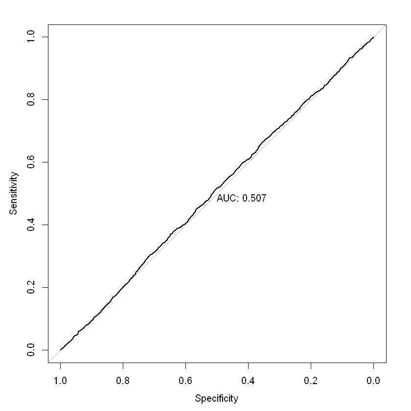
ROC / AUC#
The ROC (Receiver Operating Characteristic) curve is a graph with:
The x-axis showing the False Positive Rate
The y-axis showing the True Positive Rate
ROC curves start at 0 on the x and y axis and rise to 1. The faster the curve reaches a True Positive Rate of 1, the better the curve generally. A model on the diagonal is only showing a 50/50 chance of correctly guessing the probability of claim. Area under an ROC curve (AUC) is a measure of the usefulness of a model in general, where a greater area means more useful. AUC is a tool for comparing models (generally, the closer the AUC is to 1, the better, but there are some cases where AUC can be misleading; AUC = 0.5 is a model on the diagonal).
In our binary model, the AUC is not much better than 0.5, indicating a very weak predictive ability. It isn’t hugely surprising that our model is not very effective at predicting individual claims. As noted earlier, for insurance applications, we are usually more concerned with predicting the claim rate and how it varies by predictors like age and sex Piet de Jong, Gillian Z. Heller, 2008, p108-109).
par(mfrow = c(1,1))
roc = roc(df_test_pred$inc_count_sick, df_test_pred$pred_rate_inc_count_sick, plot = TRUE, print.auc = TRUE)
as.numeric(roc$auc)
coords(roc, "best", ret = "threshold")
Setting levels: control = 0, case = 1
Setting direction: controls < cases
| threshold |
|---|
| 0.001932091 |
References#
Ian Welch. 2020. “Joint Study Reveals Large Rise in Life Insurance Claims Costs.” https://home.kpmg/au/en/home/media/press-releases/2020/06/joint-study-reveals-large-rise-life-insurance-claims-costs-22-june-2020.html.
James Louw. 2012. “Disability Income ProductInnovation in Australia.” Australia: Gen Re. http://www.actuaries.org/HongKong2012/Presentations/WBR5_Louw.pdf.
Jeff Webb. 2017. “Statistics and Predictive Analytics.” https://bookdown.org/jefftemplewebb/IS-6489/logistic-regression.html#assessing-logistic-model-fit.
Piet de Jong, Gillian Z. Heller. 2008. Generalised Linear Models for Insurance Data. Cambridge University Press. https://ggplot2.tidyverse.org/reference/ggtheme.html.
pkgdown. n.d.a. “Create a New Ggplot.” https://ggplot2.tidyverse.org/reference/ggplot.html. ———. n.d.b. “Ggplot Themes.” https://ggplot2.tidyverse.org/reference/ggtheme.html.
SOA. 2019. “Analysis of Claim Incidence Experience from 2006 to 2014.” USA: SOA. https://www.soa.org/resources/experience-studies/2019/claim-incidence-report/.